Implementing Dark Mode in iOS 13
Implementing Dark Mode in iOS 13
After years of waiting and anticipation, iOS 13 finally supports native Dark Mode! Users can choose to enable a system wide dark appearance that will be supported in all official apps. As we’ll see, Apple has also made it easy for developers to add dark mode support with minimal effort.
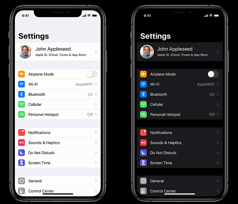
In iOS 13.0 and later, people can choose to adopt a dark system-wide appearance called Dark Mode. In Dark Mode, the system uses a darker color palette for all screens, views, menus, and controls, and it uses more vibrancy to make foreground content stand out against the darker backgrounds. Dark Mode supports all accessibility features.
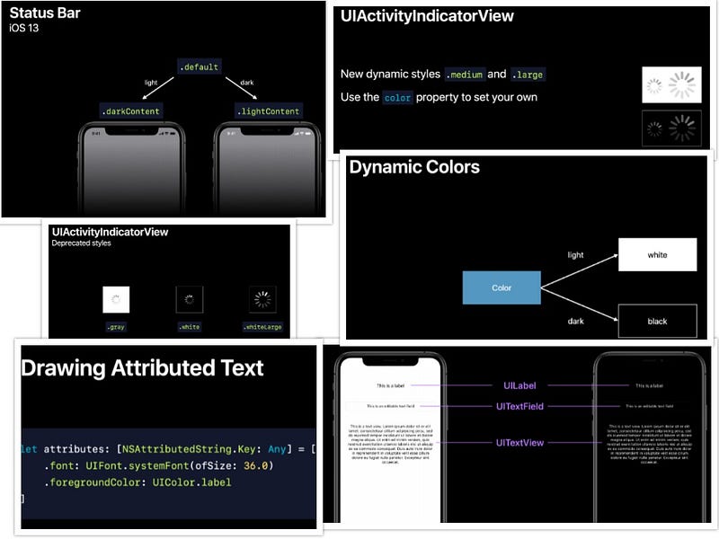
Summary (iOS 13 dark mode support changes):
1. Status bar style — default , darkcontent , lightcontent
2. Activity indicator — medium , large , Depreciated (gray, white, whitelarge)
3. UILabel, UITextField, UITextView — Use Semantic Colors or Custom Colors for light and dark mode
4. AttributedString — requires to provide foregroundColor
5. For Embedded web content — Declare supported color schemes with color-scheme, Use prefers-color-scheme media query for custom colors and image
6. Images — Dark mode images
7. Images Tint Color — Dark mode tint color
Designing for Dark Mode
- Use UIKit colors, materials, views, and controls
- Customize colors and images when necessary
People can choose Dark Mode as their default interface style, and they can use Settings to make their devices automatically switch to Dark Mode when ambient light is low.
There are three things need to take care of :
- Focus on your content. Dark Mode puts the focus on the content areas of your interface, allowing that content to stand out while the surrounding UI recedes into the background.
- Test your design in both light and dark appearances. See how your interface looks in both appearances, and adjust your designs as needed to accommodate each one. Designs that work well in one appearance might not work in the other.
- Ensure that your content remains comfortably legible in Dark Mode when you adjust the contrast and transparency accessibility settings.
Good news: enabling dark mode support in your app is as easy as building with the new iOS 13 SDK! When using the latest SDK, iOS will automatically update system controls such as switches, table views and buttons.
However, iOS does not automatically switch images or text colors, so you will probably notice quite a few issues with your app in dark mode.
Luckily, thanks to the numerous improvements Apple has made to asset catalogs in the past few years, most iOS apps should be able to adopt dark mode without significant code changes.
Adapting Colors
Dynamic System Colors
iOS 13 now includes new system colors in
UIColor, such
as a
label color. By
using the new system colors available in iOS 13, your app can
automatically support dark mode and high contrast modes.
Don’t hard-code system color values in your app.
When specifying colors for objects in your views, it’s often
easier to use the built-in semantic colors of
UIColor rather
than specifying our own custom colors that might not look good
in both light and dark mode.
For example, when you are coloring a label, use
UIColor.label,
.secondaryLabel, or similar so that UIKit will automatically make sure it
stands out.
mylabel.color = UIColor.secondaryLabel
System Colors
For backgrounds you should use
UIColor.systemBackground,
.secondarySystemBackground, or similar so that when you layer one view over another they
don’t appear to become merged.
And when you’re using fixed colors like
.red or
.blue
you should instead use .systemRed or .systemBlue
to get a color that will adapt to the user’s trait
environment
– it will be a lighter red when in dark mode, and a darker red
in light mode, rather than the fixed pure red of
.red.
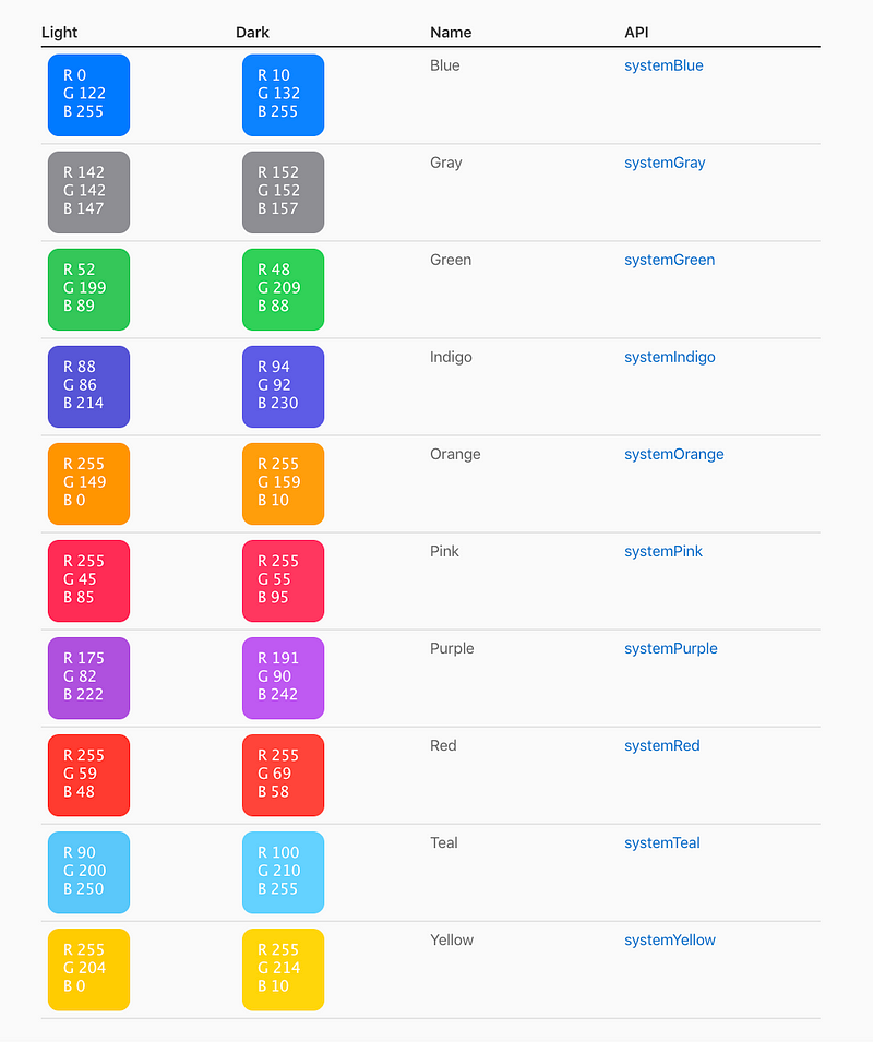
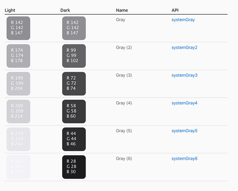
iOS 13 also introduces a range of six opaque gray colors you can use in rare cases where translucency doesn’t work well. For example, intersecting or overlapping elements — such as lines or bars in a grid — look better with opacity. In general, use the semantically defined system colors for UI elements.
Custom Colors
Although it is strongly recommended that you use system colors to automatically adapt to interface changes and ensure consistency across apps, you may want to support dark mode on custom colors.
Using iOS 13’s new asset catalog colors makes it trivial to support dark mode by adding dark versions of custom colors.
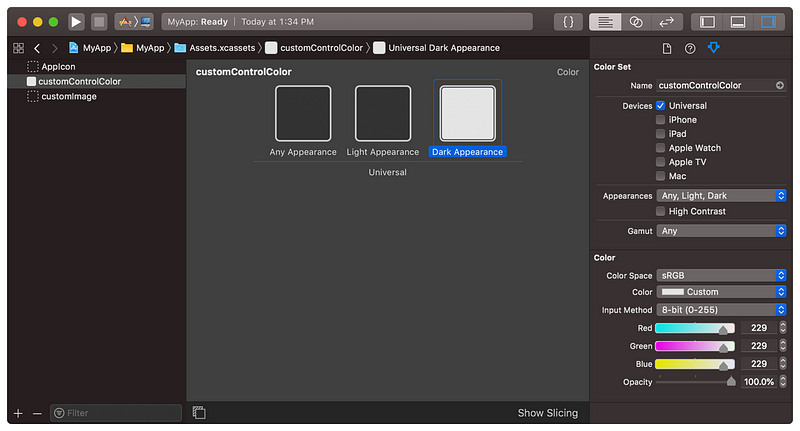
To add a dark version of asset catalog color, just select the
color in the catalog, then switch
Appearances to
Any, Dark in
the Attributes Inspector. Then, add the dark appearance version
of the color.
That’s it — iOS will automatically switch to the dark version of asset catalog colors when dark mode is enabled, with no extra work from you!
Dynamic Images

Adapting Images

While most images should look fine in dark mode, especially if you are using template images which will automatically change tint if you put in the work to automatically switch colors (see Adapting Colors above), you might want some images to have a different color or look on dark mode.
Like with asset catalog colors, it’s trivial to automatically
switch images in the asset catalog when dark mode is enabled. To
add a dark version of any image, just select the image in the
catalog, then switch
Appearances to
Any, Dark in
the Attributes Inspector. Then, simply add the dark appearance
version of the image.
Create Images for All Appearances
Make sure the images in your interface look good in both light and dark appearances. Interfaces use images in many places, including in buttons, image views, and custom views and controls. If an image is difficult to see when changing appearances, provide a new image asset that looks good in the other appearance. Better yet, use a symbol image or template image, which define only the shape to render and therefore do not require separate images for light, dark, and high-contrast environments.
Update Custom Views Using Specific Methods
When the user changes the system appearance, the system automatically asks each window and view to redraw itself. During this process, the system calls several well-known methods for both macOS and iOS, listed in the following table, to update your content. The system updates the trait environment before calling these methods, so if you make all of your appearance-sensitive changes in them, your app updates itself correctly.
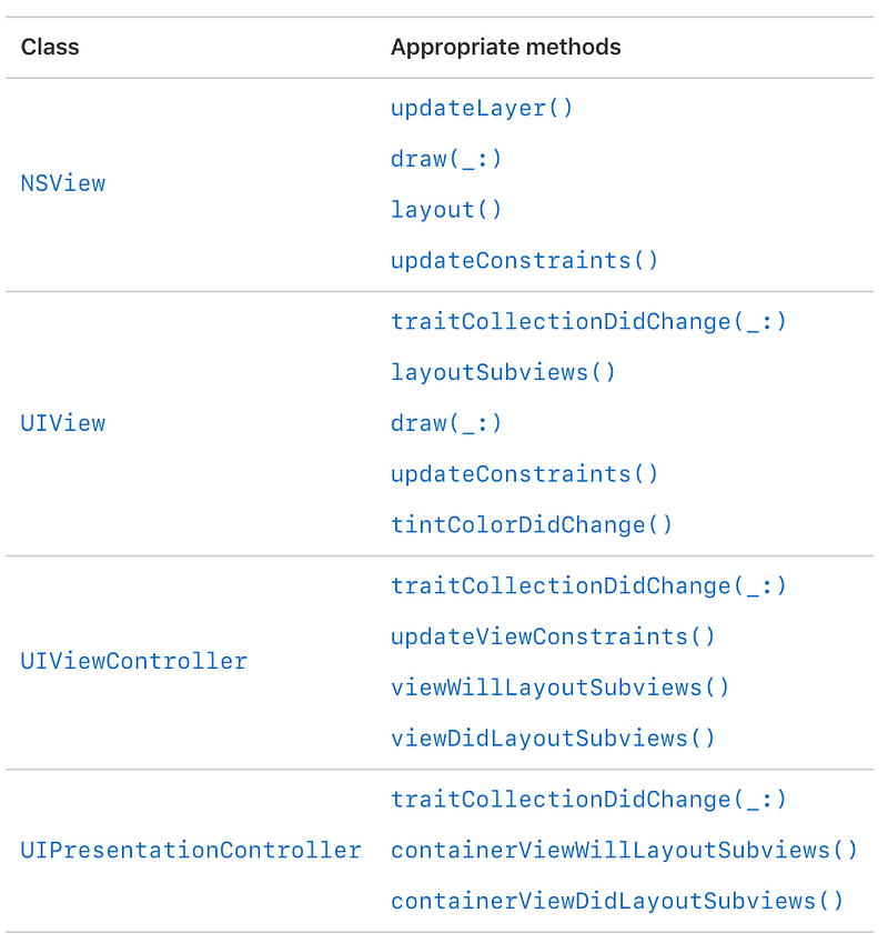
Trait Collection Changes in iOS 13
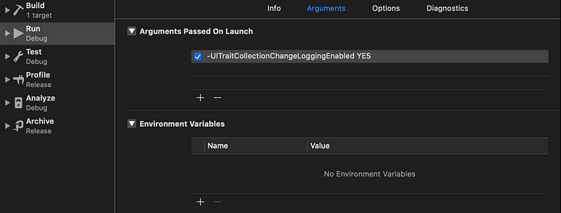
Enable debug logging with launch argument — UITraitCollectionChangeLoggingEnabled YES
Detecting Dark Mode Programmatically
There may be some cases in which you want to detect appearance changes programmatically and change your user interface accordingly.
override func traitCollectionDidChange(_ previousTraitCollection: UITraitCollection?) {
    super.traitCollectionDidChange(previousTraitCollection)

    let hasUserInterfaceStyleChanged = previousTraitCollection.hasDifferentColorAppearance(comparedTo: traitCollection) // Bool
    // Update your user interface based on the appearance
}
Overriding the User Interface Style
The system automatically opts in any app linked against the iOS
13.0 or later SDK to both light and dark appearances. If you
need extra time to work on your app’s Dark Mode support or want
to keep your app in a single style, you can opt out by including
the
UIUserInterfaceStyle
key (with a value of
Light or
Dark) in your
app’s Info.plist file. Setting this key causes the system to
ignore the user’s preference and always apply the specific
appearance to your app.
⚠️ Note:
Supporting Dark Mode is strongly encouraged. Use the
UIUserInterfaceStyle
key to opt out only temporarily while you work on improvements
to your app’s Dark Mode support.
Specific Screens
In iOS 13, you can now override the user interface style on specific views or view controllers. For example, you may want only a certain view controller to be in dark mode, while the rest of your app is in light mode.
To override the user interface style, just override this variable in the top view or view controller and it will propagate down to subviews:
// Inside a UIViewController override func viewDidLoad() {     super.viewDidLoad()
// Always adopt a dark interface style.         overrideUserInterfaceStyle = .dark
}